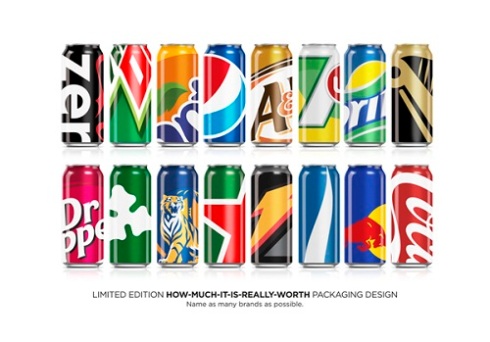
Just a quick one… So whilst I was procrastinating my uni work I stumbled across this on one of favourite websites: designtaxi.com. It immediately caught my eye and I thought it summed up the phrase ‘less is more’ perfectly.
The packaging looks eye catching and unique whilst still being easy to identify what brand it is. Simply zooming in on a particular area of a logo I think has provided some stunning packaging designs. It goes to show what an impact certain brands/logos have had on society and how just a snippet of a logo, people can still identify the brand simply down to the font, colours and shapes. Here is the link to the website: http://designtaxi.com/news/355195/The-Big-Brand-Theory-Repackaging-Popular-Beverage-Brands/

578367 551415This really is often a great weblog, could you be interested in working on an interview about just how you developed it? If so e-mail myself! 489785
LikeLike
262166 482582I�m glad to become a visitor in this pure internet site, regards for this rare information! 120871
LikeLike
290739 264645This write-up gives the light in which we can observe the reality. This is extremely nice one and gives in-depth info. Thanks for this nice write-up. 186608
LikeLike
931430 75929I believe this website contains some very wonderful information for everyone : D. 489802
LikeLike
hi Nice Blog
LikeLike